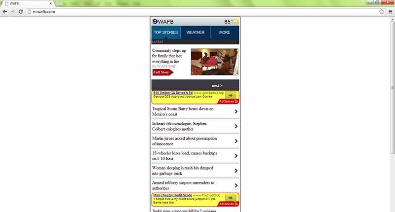
Last week I talked about what RWD is and
why m-dot sites suck. Here’s a pros and cons list to show why RWD is becoming
the new best practice, and what challenges firms will face along the way.
PROS
One
code to rule them all
Having one code means having one site,
which means you avoid having to maintain, test, and re-write separate desktop
and m-dot sites. This also means that you’ll have one team working on your one
site, instead of possibly having two teams.
SEO
won’t be spread thin
Your desktop and m-dot site won’t be
competing against each other for the top ranking.
Consistent
UX
As mentioned in the last RWD post,
different screens and devices should be considered facets of the same
experience, not an experience composed of disjointed ones.

Google
says you should do it
Google prefers you only have one URL. You
should probably listen to Google.
Optimizes
presentation of content and navigation
The way your website looks to the user is
consistent across all platforms, and is completely in your control. Companies
won’t have to worry about whether or not their navigation menus or images will
be rendered properly when viewed on a small screen or when the browser is
resized.


Not
as risky for small companies or websites with few pages
The fewer the pages, the less rewriting,
testing, and maintaining developers will have to do.
Advertising
can be streamlined
Ads were normally sold based on the desktop
or m-dot sites, with m-dot ad space as an “add on.” Now, ads can be packaged as
a “single booking” with a mobile/tablet opt-out. But given the fact that so
many people are using their mobile devices to browse the web, advertisers would
be hard-pressed to find a reason why they would want to opt out of reaching so
many people.
CONS
It’s
complex
A lot of people don’t fully understand what
RWD is, they see it as a big scary new technology, when it’s really just a new
way of designing websites. Because of this, there has been relatively low
adoption from anyone outside of tech blogs, web design firms, and early
adopters like The Boston Globe. Despite these skewed perceptions, there is
still a lot of work involved in rewriting the front-end code:
- Breakpoints, the screen size at which a piece of code will be triggered to resize or reconfigure the components of the page, need to be determined for different screen sizes.
- Graceful degradation needs to be considered. Your site might collapse to a single-column mobile site from a three-column desktop site. You’ll need to consider the ease of navigation and the user experience.

It’s
costly and time-consuming
As mentioned, there’s a lot of rewriting to
do, and it may require specialised web developers and a large initial
investment.
RWD
isn’t supported by older browsers
Although, this shouldn’t be a huge problem
given that the majority of users are using up-to-date browsers.
Load
times may be slow on mobile
When a website uploads a picture onto their
page, they’re uploading an image that is the best resolution for a desktop
computer. So when a user is loading the page on their phone, they’re
downloading the full image, it’s just being resized to fit your 4.7-inch
screen.


Risky
for large companies or websites with a lot of pages
Given the amount of rewriting, testing, and
maintaining involved, the RWD facelift is a huge investment both in time, cost,
and expertise.
Existing
web servers are not compatible for RWD
Desktop servers simply require the user to
fetch the information. This requires a lot of work from the browser, but it’s
not a huge deal since most people have relatively fast Internet speeds and
don’t have to worry about data usage. Mobile ad servers, on the other hand,
have to worry about speed and data usage but also have to work with slower
Internet speeds. RWD websites will need both a desktop and mobile ad server to
host ads since there are no existing web servers that are optimised for both.
Advertising
can also get complex
Marketers may not be able to tailor their
ads to different user environments or contexts. In a previous blog, I discuss
playing a “catch me if you can” game with consumers, where consumers engage in
multi-device web browsing. Ads that target those on their phones on the bus
will be different from those on their tablets at home or sitting in the office
in front of their desktop computer. If a website is selling ad spots on their
RWD website, how will the website determine which spots will be designated to
mobile-targeted ads? It could be based on pre-set parameters such as breakpoints,
but…
Ad
tags make things even more complicated
An ad tag is a tag that helps Google
determine whether or not an ad is appropriate for any given online ad space. As
mentioned, marketers want to target consumers based on context and device.
As a result, ad tags tend to differ between mobile and desktop sites. This
means that developers will have to decide which ad tags will be appropriate for
which break points.
In some cases, RWD may not be attainable, especially given the substantial initial investment (both in terms of time and money) involved. However, RWD seems to be the new "best practice" for web design. What are your thoughts?
Sources:
In some cases, RWD may not be attainable, especially given the substantial initial investment (both in terms of time and money) involved. However, RWD seems to be the new "best practice" for web design. What are your thoughts?
Sources:
- Forrester Research
- This awesome ebook from Mobify